What we made it and why.
Long-form notes on the speculative concept builds we make between client briefs. Each post is the brief, palette, typography, motion language and technical trade-offs we made for one concept — written for anyone who wants to look under the hood.

AXIRYA: building bright editorial e-commerce
Why we chose a single master gradient that flows from sunset through lavender, why every decorative bubble and cloud is pure CSS, and the trade-offs of layered scroll-driven depth.

Yamabe: telling a whisky brand as a magazine
Treating a product page like an editorial spread — stage-curtain loader, pinned cooperage horizontal scroll, and the discipline of four crossfaded eras behind a static bottle.
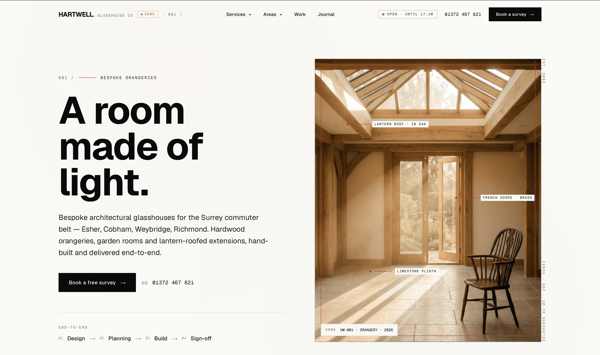
Hartwell Glasshouse: building a bespoke-orangery brand
An editorial / architect aesthetic — drafting-frame photo hovers, a page-transition sweep, generous whitespace, and area-specific grounding across the Surrey commuter belt. The visual language signals craft before a single product photograph.

The Roper: a barbershop with a razor in its hero
How a sideways-sliding loader, a floating straight razor, and a live "open now" indicator turned a barbershop concept into a piece of work we kept going back to.

Slow Press: when type does the heavy lifting
An oversized kinetic wordmark that fills the viewport on first paint, then scrubs into a pinned product drop with three coffee bags. Notes on letting typography be the brand.